Care Concierge came to us as a senior care enterprise with genuine expertise and a clear point of view — but a brand that didn’t show it. A sky-blue logo that felt more clinic than warm. A website that had grown in layers as all startups do, but over time had scattered visual or content hierarchy.
There’s a real challenge of communicating in this space.
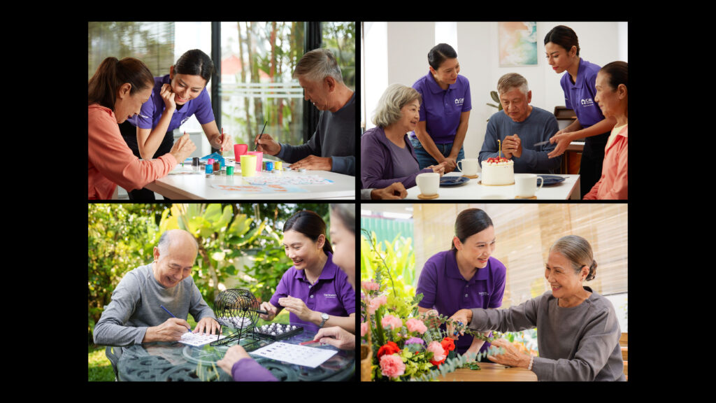
Senior care in Malaysia carries the weight of filial piety: the deeply held cultural belief that caring for aging parents is a family’s duty, not something you hand to others. The category is still largely unspoken, and the stakes of getting the tone wrong are high. Talk down to seniors and you lose them. Sell too hard to families and you make them feel guilty. The brand had to navigate all of this while communicating Care Concierge’s core distinction: not a caregiving aggregator, but a genuine senior care specialist that listens, assesses, and builds a plan for person-centric care. The brand needed to say we understand you.
What we anchored on
Before we touched a single visual, we had to get the positioning right. That difference — between a vendor and a trusted expert — had to run through everything.
We established two key anchors:
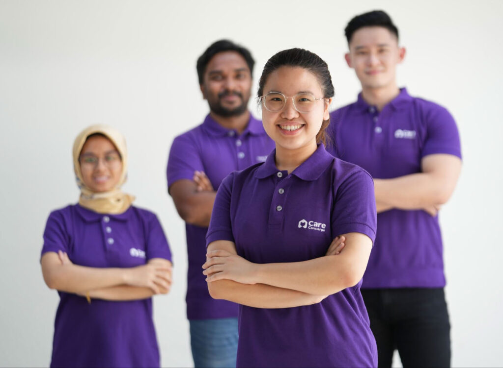
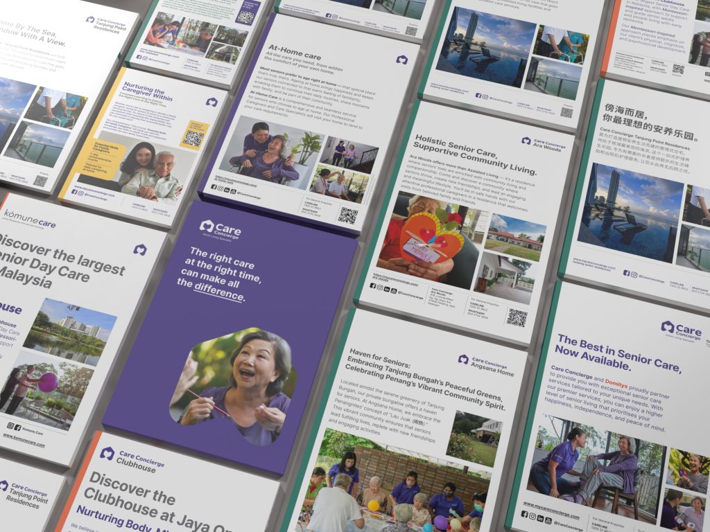
- Moving the brand’s colours to periwinkle and yellow was a key move. Instead of feeling medical or childlike, the brand needed to feel grown-up and reassuring. Periwinkle purple is sophisticated and modern, with yellow carrying warmth and a sense of activity and life.
- Tone needed to shift from matter-of-fact to something closer to a caring expert in the room: empathetic, empowering, giving people back a sense of choice rather than making them feel like a problem to be managed. Less selling, more understanding.
What we built
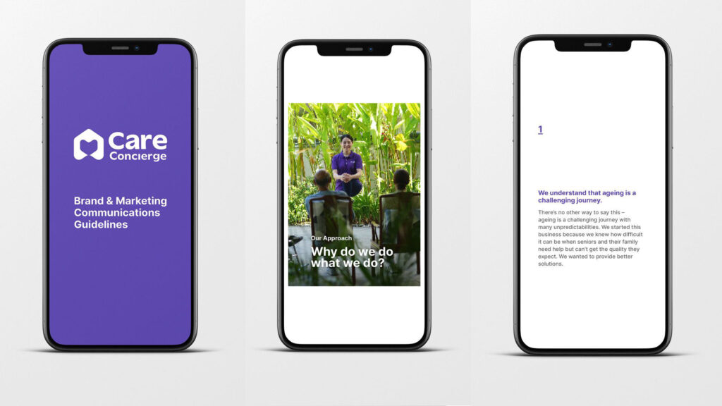
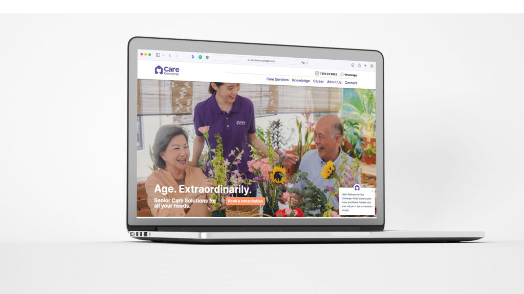
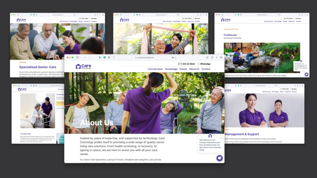
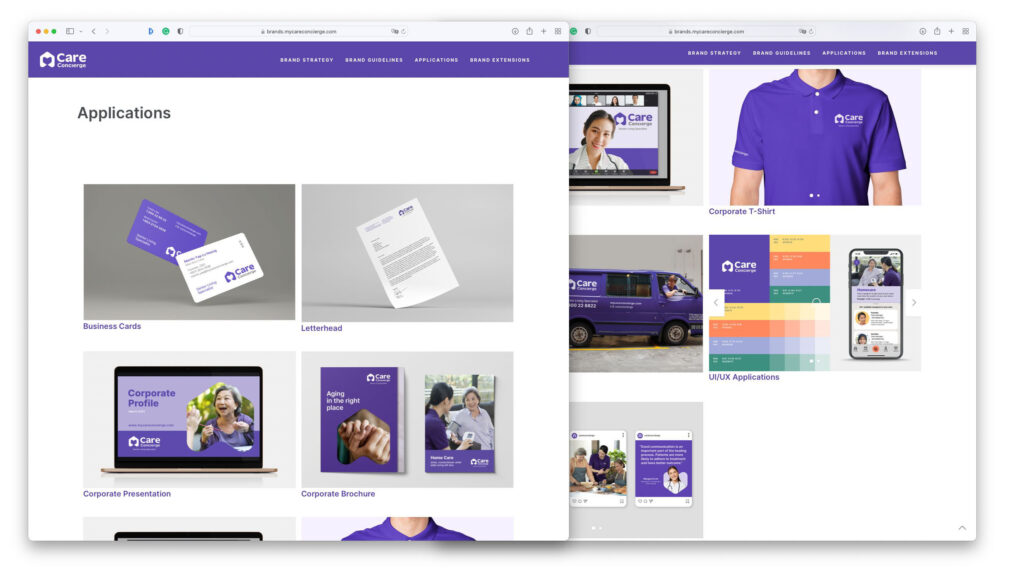
The rebrand covered the full stack: logo refinement, colour system, typography, visual language, social communications, and a brand guideline kit built to actually be used. We’ve seen brand guidelines full of aspirational moodboards that no external agency ever follows. So we built the opposite — a Digital Kit. Clear downloadable logo assets, concise dos and don’ts for both visual and language, explicit guidance on what goes where. Practical enough to hand to anyone without the work falling apart.
What came after
Care Concierge went on to raise investment. The rebrand was part of that conversation — it showed clarity of intent and a brand that could hold its own against larger players. In a category where trust is everything, knowing exactly who you are — and being able to show it — turns out to matter a great deal.
Today, Care Concierge has grown into a full-service senior care organisation with assisted living residences across Malaysia, a caregiver training academy, and a proprietary care app. The brand has had to stretch a long way from where it started. We’re grateful to have given them a good system for it.